Last week I saw a post on Hacker News called “How to get your app noticed on Google Play.” If you’re interested in that type of stuff, go check it out.
I started messing around with Android when I was 15. Writing a few one-feature apps (think soundboards and tip calculators) got me familiar enough with the platform to have a go at a market-ready product. As a kid I loved playing Brick Breaker on my dad’s Blackberry, so I decided to build a clone called Brick Breaker Free (BBF).
Reading the article brought back some great memories of high school where I faced similar challenges bringing an app to 100,000 downloads. Luckily I know some tricks that the author didn’t mention, enough to kickoff my first blog post with some sort of story/tutorial hybrid. Here’s the rundown:
My story may not help you
Let me take a moment to say that there are many, many different types of mobile applications. The marketing tactics that work for one app may be wholly ineffective or even harmful for others.
I had known from the start that I wouldn’t make much money. Android developers get more downloads on average than iOS devs, but they earn about 1/5 as much money per download. Furthermore, being able to say “100k people have used my software” can provide returns far greater than the cash upside (think college admissions, scholarships, and job applications). I highly recommend keeping this in mind — often times, the number of downloads you can get is inversely related to how much you monetize your app.
First Principles
Lets think about the steps leading up to a user downloading an app.
- User goes to the Play Store with the intent to browse/download
- User finds an app through browsing or, much more likely, searching
- User looks at screenshots, perhaps looking at the description or reviews, and makes the decision to install.
Your goal as a developer (in addition to building something you personally enjoy and learn from!) is to make each step in the process as frictionless as possible and to widen the sales funnel. One of my favorite things about Android is the size of the platform (hint: it’s huuuge!). If all three of the above steps are facilitated, you’ll be in a good place.
Step 1: Understanding Intent
As it turns out, a lot of people like Breakout style games. Although I wish I had the foresight and market understanding to intentionally choose such a lucrative genre, I just got lucky on this one. I wanted to recreate a childhood favorite and BBF was simple enough that I could actually build it given my amateur coding skills.
What I would have done if I were a little more deliberate is gather key metrics on the idea’s genre/space. If you wanted to build, say, Uber for dog-sitters (update: it turns out this actually exists!), make a list of keywords and search for the common permutations on Google Play. Then look at the top 20 apps, get an estimate of how many users they have (look for the range that Google gives).
Select a search-term namespace that already has over a million users because it’s quite difficult (and often expensive) to organically generate demand/intent. Unless you’ve got unique insight into the direction that user demand is going, breaking into an existing market segment will be a lot easier.
Step 2: The dirty growth-hack that set the wheels in motion
When I published BBF, only a few people happened to stumble upon my app each day. It’s hard to stand out when there’s 50 other games with a similar name and purpose. I tried the default tactics like posting to websites and sending links to friends. Nothing really caught on. Driving growth through posting online is time consuming and hard.
Luckily, I had turned 16 and gotten my driver’s license a few months before publishing the app. I drove to Best Buy, the AT&T store, and anywhere else I could find android-powered smartphones. Then I installed my app on each available demo phone, bookmarked a link to the Play Store page, and rearranged the home screen to favorably display my app’s icon. Supposedly this caused random customers to see the app and install it themselves.
Originally, BBF was nowhere to be found if one were to search with the words “brick,” “breaker,” “breakout,” or any similar phrase. After Google’s algorithm saw some growth and a sudden bump in it’s popularity, BBF consistently appeared in the top 12–36 results for relevant searches.
Given the sheer volume of Google Play searches, that ranking did wonders for my discoverability. I can’t give a hard number on how many people viewed my app, but it got hundreds of thousands of eyes on the store listing. That got the snowball rolling.
Unfortunately the trick that worked for me probably doesn’t work anymore. Last time I checked, retail stores got sick of people like me and restricted the demo settings/permissions, so you’ll just have to get creative when building a critical-mass user base.
If you don’t mind sifting through the results of such a buzzword, try Googling “growth hacking” and think about the tactics that you may find to be effective.
Step 3: Design
Once a user has stumbled across an app (meaning they completed the first two steps in the process I outlined earlier), they need to see enough potential value to hit the install button.
I say “potential” because you don’t need to prove that you’re the perfect fit to the user’s needs — that’d be a pretty high bar to meet. It’s easy enough to test out an app and uninstall it when boredom hits, so you’ll just need to show that your app has some social proof and looks like it could be good.
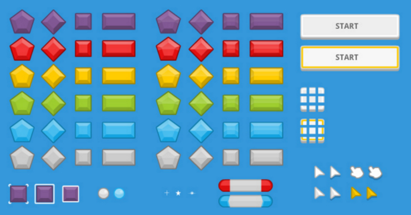
Given my acute laziness and lack of artistic skills at the time, I searched the web for a generously-licensed design package. This set of sprites by Kenney Land looks great:

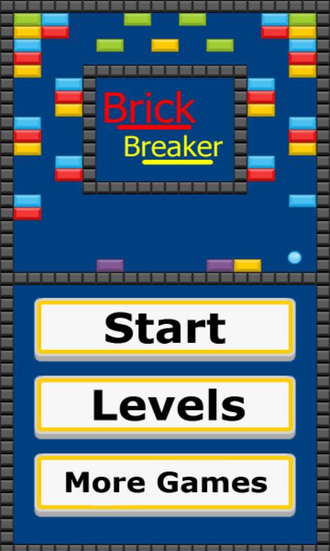
Once I had elegant art to use as building blocks, I designed a playful and colorful home screen:

Then I gave special thought to photoshopping an app icon, as they are first impressions and the face of your application until a user clicks on the store listing. Take care to design a bright and simple icon — which one of the following apps stands out at first glance?

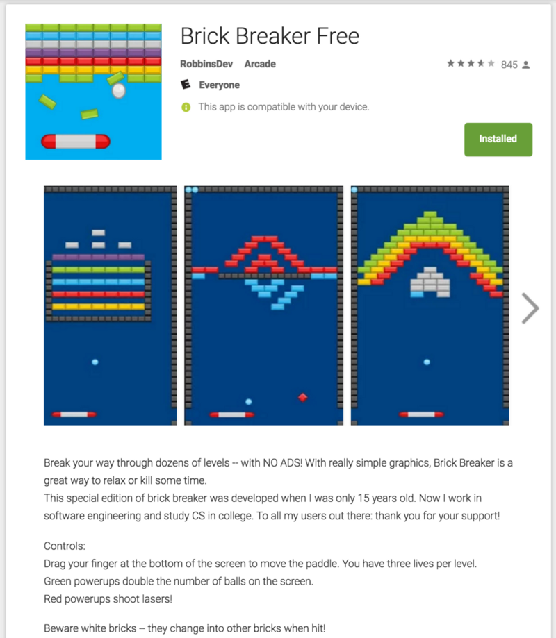
Finally, I cherry-picked some of the most colorful and symmetrical levels to represent gameplay. Here’s the final Google Play store listing. Clean, colorful, and to the point (at least enough so!):

Results
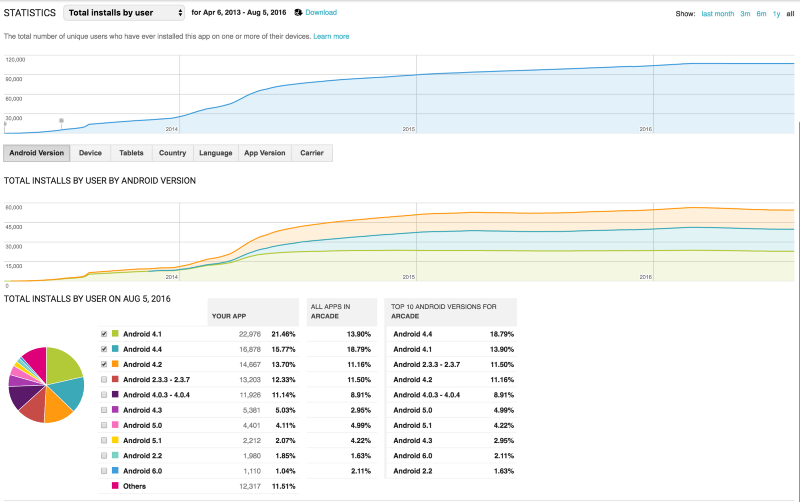
This is the growth chart of my app over time. Clearly I’ve hit the ceiling set by my app’s engineering quality, design quality, Google Play reviews, and the number of people in the market for a Brick Breaker clone.

Overall, I’m very happy with BBF’s performance. I do have one regret, however, and that is not diving deeper into analytics or A/B testing. It wasn’t easy finding information on Android’s metrics (questions like “what does it mean if my users have older versions of Android installed?” were left unanswered) and I bet there’s a lot of valuable insight somewhere out there. If anyone reading this is aware of good resources on the topic, let me know!
That’s all I’ve got for today. If you’ve read this far, follow my blog for more in the future!
(By the way, if you’d like to purchase a nifty app called Brick Breaker Free, contact me. I’m looking to cash out on this project)
Bonus anecdote: a failed experiment
Towards the beginning of this post, I mentioned that I didn’t try or even want to make money with my app. Although that’s true for the most part, I did explore monetization options after the app had caught on.
At the time, the mobile game dev community was having a vigorous discussion about the future of mobile app business models. Freemium, Tiered-Service, and DLC strategies were being fleshed out and tested on large-scale platforms by different companies. And it didn’t help that Zynga’s stock had crashed and was showing no signs of recovery.
Since my opportunity cost was so low, I decided take the contrarian route and perform a little experiment: give away my app for free, no strings attached. I simply added a page that said something along the lines of “I am a high school student who works hard to maintain this app. If you feel that I deserve it, click here to donate an amount of your choosing.”
It seemed to me that AdBlock was successful with this model (which I later learned is called Donationware) so I figured I’d give it a try. The mobile game industry had to be so laser-focused on their bottom line that it could easily overlook such a strategy. After all, if anyone could pull off the Donationware scheme, it’d be the high school student who politely asks for money to spend on software and education.
So what happened? The experiment successfully produced evidence relating to my hypothesis. And by that I mean it proved my ideas were completely wrong. Out of the tens of thousands of people who installed my app, I think I convinced 4 of them to donate a total of $5.
Oh well, now we know without a doubt that people truly do prefer things to be free! Who could have guessed?
Thoughts? Tweet me at @whrobbins or find my email at willrobbins.org!